App card
App card
App cards are based on card items. They enable synced information exchange with a similar data source, such as a card or a ticket, in an external application.
The app that creates the app card needs to include the logic to map the app card to a corresponding data source in the external application, and to maintain data syncing.
Apps have full control over the content in the modal displaying the detail view of an app card.
In the app card detail view modal, apps can enable viewing and editing the data fields that map to the source card or ticket in the external application that integrates with the Miro board.
App cards and cards share the same properties, with the following exceptions:
- App cards lack
assigneeanddueDate. - App cards have additional properties:
fields: the custom fields that apps can define in app cards are objects in thefieldsarray.
They are displayed as previews in the app card compact view.owned: the read-onlyownedproperty controls read and write access to the app card, and it's assigned automatically.
To modify an app card, you need to edit it with the same app that generated the app card.
Otherwise, the app card is available in read-only mode.status: apps can set thestatusproperty of an app card to notify users about the availability of the app card, and the actions that they can perform on it.
When creating or updating an app card item, you can define its dimensions in the following way:
widthcan be set on creation, and on update to resize the app card.
Default width:320dpheightis read-only. It's calculated automatically, based on the values assigned to the app card properties.
Default height:94dp
ℹ️ Note:
- Only the app that creates the app card has read and write access to it.
Other apps can only do the following:- Read the app card properties.
- Read and update the app card
xandyposition on the board.
- To open the detail view from an app card's compact view, the app must listen to the
app_card:openevent.
A typical use case forapp_card:openis to open a modal displaying content fetched from a specified URL.
For more information, seeapp_card:open. - There's a limit to the number of custom fields that you can add:
- Cards and app cards support up to 20 custom fields.
- If you try to create a card or an app card with more than 20 custom fields, the operation fails silently, and the card or app card isn't created.
💡 You can set a custom icon for your app card through the UI on the app settings page.
Example:
const appCard = await miro.board.createAppCard({
  title: 'This is the title of the app card',
  description:
    'The custom preview fields are highlighted in different colors; the app card icon is displayed on the bottom-right.',
  style: {
    cardTheme: '#2d9bf0',
  },
  fields: [
    {
      value: 'Owner',
      iconUrl: 'https://cdn-icons-png.flaticon.com/512/921/921124.png',
      iconShape: 'round',
      fillColor: '#FBE983',
      textColor: '#F83A22',
      tooltip: 'Caption text displayed in a tooltip when clicking or hovering over the preview field',
    },
    {
      value: 'Timeline',
      iconUrl: 'https://cdn-icons-png.flaticon.com/512/3094/3094861.png',
      iconShape: 'square',
      fillColor: '#F8D878',
      textColor: '#503000',
      tooltip: 'Caption text displayed in a tooltip when clicking or hovering over the preview field',
    },
    {
      value: 'Tasks',
      iconUrl: 'https://cdn-icons-png.flaticon.com/512/3176/3176366.png',
      iconShape: 'square',
      fillColor: '#bef2f2',
      textColor: '#0713FF',
      tooltip: 'Caption text displayed in a tooltip when clicking or hovering over the preview field',
    },
    {
      value: 'Bug fix',
      iconUrl: 'https://cdn-icons-png.flaticon.com/512/3867/3867669.png',
      iconShape: 'square',
      fillColor: '#E5E5E5',
      textColor: '#000000',
      tooltip: 'Caption text displayed in a tooltip when clicking or hovering over the preview field',
    },
  ],
  x: 2000,
  y: 2000,
  width: 320,
  rotation: 0.0,
  status: 'connected', // Default status of new app cards: 'disconnected'
});

// Listen to the 'app_card:open' event
miro.board.ui.on('app_card:open', (event) => {
  console.log('Subscribed to app card open event', event);
  const {appCard} = event;

  // Fetch a specific app card by specifying its ID
  const url = `https://my.app.example.com/modal.html?appCardId=${appCard.id}`;

  // Open the modal to display the content of the fetched app card
  miro.board.ui.openModal({
    url,
  });
});

// Output the created item to the developer console
console.log(appCard);
App card item, compact view:
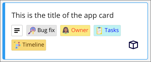
Figure 1. Compact view of an app card. The custom preview fields are highlighted in different colors. The default app card icon is on the bottom right. The status icon is displayed when hovering the mouse over the top-right corner of the app card.
Properties
title
string
A short text header for the card.
The text must be shorter than 6000 characters.
title supports plain text, and the following HTML tags:
<p><a><br>
Unsupported HTML tags are automatically stripped.
description
string
A short text description to add context about the card.
The text must be shorter than 6000 characters.
description supports plain text, and the following HTML tags:
<p><a><strong><b><em><i><u><ol><ul><li><br>
Unsupported HTML tags are automatically stripped.
owned
readonly boolean
A read-only Boolean value that controls read and write access to the app card.
owned: true: the app requesting access can read and write to the app card properties.owned: false: the app requesting access can only read the app card properties.
ℹ️ Note:
- Only the app that creates the app card has read and write access to it.
Other apps can only do the following:- Read the app card properties.
- Read and update the app card
xandyposition on the board.
status
'disabled' | 'disconnected' | 'connected'
Apps can set the status property of an app card to notify users about the availability of the app card, and the actions that they can perform on it.
Apps can set the following app card status values:
The Miro Web SDK can set the following app card status value:
Default: 
disconnected
This is the default status of all newly created app cards, before they are mapped to a data source in the external application.
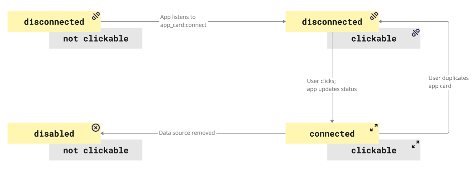
Figure 1. After installing and authorizing the app, it can update the status of its app cards as shown in the diagram.
App card status: disconnected
disconnectedStatus icon:
The disconnected icon is clickable.
By default, newly created app cards have a disconnected status, unless the app card constructor sets a different value.
The app needs to include the logic to map the app card to a corresponding data source in the external application, and to maintain data syncing.
If an app card is created without using the app, the app card status is set to disconnected.
When an app card is disconnected, it's not mapped to a data source. The app card is out of sync, and its content isn't updated to reflect the external data source.
This can occur when an app card:
- Is created manually on the board UI by duplicating an existing app card.
- Is created as a result of copying a board.
- Is created as a result of restoring a board from board history.
- Is restored from the board activity.
- Is uploaded to the board from a backup copy.
Manual copy of app cards on the UI
Users who haven't authorized the app can still manually duplicate app cards on the board UI. For example, by copying and pasting them.
This action produces a new app card that differs from the original it was copied from only for the item id.
The Web SDK detects the manually copied app card, and it sets the app card status to disconnected.
Even if the current user has the app to create app cards, the copied app card is available in read-only mode.
App card status:disabled
disabledStatus icon: 
The disabled icon isn't clickable.
An app can set an app card status to disabled when the corresponding data source is deleted in the external application.
Since the data source is missing, the app card no longer receives updates. A disabled app card is available in read-only mode.
App card status: connected
connectedStatus icon: 
The connected icon is clickable.
An app can set an app card status to connected.
If the app listens to the app_card:connect event, the event handler can include the logic to map the app card to a data source in the external application so that the app card can sync with and receive updates from it.
When users click the icon, the app_card:open event fires, and it opens a modal with the detail view of the app card.
Typically, an app card detail view maps to the fields in the corresponding data source.
Connect an app card
To connect a disconnected app card to an external data source, developers can include in the app card a unique reference to the corresponding data source.
This source ID can be a ticket number, or a card ID. As a developer, you can store this reference in a number of ways.
For example, you can include the source ID in:
-
The
titleof the app card, and parse it at a later time.
Example:appCard.title: '[JIRA-1234] Pre-release checks' -
A custom field of the app card.
Example:appCard.fields.push({value: 'JIRA-1234'});
Missing app for the app card
Missing app icon: 
The missing app icon is clickable.
If the app that creates app cards isn't installed on the board for the current team or user, a clickable icon and a tooltip notify them.
- If an app for the app card is available on the Miro Marketplace, the icon tooltip includes the name of the app so that users can look it up on the Marketplace and install it.
- If no compatible app is available on the Miro Marketplace, the tooltip message notifies about it.
In this case, the app card isn't accessible to the current user.
fields?
Array<{
  fillColor?: string
  iconShape?: 'round' | 'square'
  iconUrl?: string
  textColor?: string
  tooltip?: string
  value?: string
}>
An array of objects.
Each object represents a custom preview field that you can define for the card.
The preview fields are displayed on the bottom half of the card in the compact view.
When rendered in the card on the board UI, the fields are automatically sorted, based on the content of the value property.
The current sort order criteria are UI-based; they may change in the future:
- Numeric, ascending.
- Alphabetic, from A to Z.
- Horizontal, from left to right.
- Vertical, from top to bottom, if the card isn't wide enough to accommodate all preview fields on one row.
For each preview field, you can define:
- The data value of the custom field.
- The color of the text.
- A background color for the preview field.
- An image for the icon.
- The shape of the icon: either round, or square.
- A short text for the tooltip that is displayed when clicking or hovering over the preview field.
There's a limit to the number of custom fields that you can add:
- Cards and app cards support up to 20 custom fields.
- If you try to create a card or an app card with more than 20 custom fields, the operation fails silently, and the card or app card isn't created.
Preview field data structure:
{
	value?: string
	fillColor?: string
	textColor?: string
	iconUrl?: string
	iconShape?: 'round' | 'square'
	tooltip?: string
}
fillColor
fillColorHex value representing the color that fills the background area of the preview field displayed on the card.
Default: transparent (no fill color)
iconShape
iconShapeDefines the shape of the icon on the preview field.
Possible values:
roundsquare
iconUrl
iconUrlA valid URL pointing to an image available online:
- The image must be publicly available.
- The transport protocol must be HTTPS.
Supported image file format:
- PNG
textColor
textColorHex value representing the color of the text string assigned to the value property.
Default: #1a1a1a (black)
tooltip
tooltipA short piece of text displayed in a tooltip.
The tooltip is displayed when clicking or hovering over the preview field.
The text must be shorter than 6000 characters.
value
valueThe actual data value of the custom field; it's visible to board users.
It can be any type of information that you want to convey.
The value custom field property can contain hard-coded values, as well as dynamic ones that are mapped and retrieved from an external data source.
style
{ cardTheme?: string; fillBackground?: boolean }
The style object groups properties that define the layout, the look and feel of specific elements of an item, when it's displayed on the board.
For example: background color, font family, font type, horizontal and vertical alignment of the text, text color, and so on.
The Miro Web SDK doesn't support all standard style, yet. Additional styles will be included in future releases.
style data structure:
style: {
	cardTheme: '#2d9bf0', // Default value: '#2d9bf0' (light blue)
},
cardTheme
cardThemeHex value representing the color of the border of the card.
Default: #2d9bf0 (light blue)
fillBackground
fillBackgroundBoolean value that indicates if the background of the card is filled or not. When true, the color of the background matches the color of the cardTheme property.
Default: false
tagIds
Array<string>
An array of tag IDs.
Each ID corresponds to a board tag attached to a card or a sticky note.
To add a tag to a card or a sticky note:
- Add the tag ID to the
tagIdsarray. - Call
syncon the item to update it on the board (see example below).
To remove a tag from a card or a sticky note:
- Remove the tag ID from the
tagIdsarray. - Call
syncon the item to update it on the board (see example below).
When you remove a tag from an item, the tag still exists on the board.
To retrieve all cards or sticky notes with one or more specific tags:
- Specify the item type to retrieve: either
card, orsticky_note. - Specify one or more tags as filtering criteria.
Add and remove tags to and from a card
Example (tag):
// Create a tag
const todo = await miro.board.createTag({
  title: 'todo',
  color: 'yellow',
});

// Create another tag
const urgent = await miro.board.createTag({
  title: 'urgent',
  color: 'magenta',
});

// Create a card and attach the tags to it
const card = await miro.board.createCard({
  title: 'card with tags: "todo", "urgent"',
  tagIds: [todo.id, urgent.id],
});

// Call 'sync' to make the attached tags visible on the card on the board
await card.sync();

console.log(card.tagIds); // => ['3074457345627244742', '307445734562724503']

// Remove option 1: remove tags from the array
card.tagIds = [todo.id];

// Remove option 2: remove tags by filtering them out of the array
card.tagIds = card.tagIds.filter((id) => id !== todo.id);

// Call 'sync' to update the card after removing the tags
await card.sync();

console.log(card.tagIds); // => []

// Delete the tags from the board.
// Bulk operations aren't supported at the moment:
// remove the tags one at a time
await miro.board.remove(todo);
await miro.board.remove(urgent);

await miro.board.get({
  tags: ['todo', 'urgent'],
}); // => []
id
readonly string
Unique ID of the item, assigned automatically upon creation.
Example: 3658432978520043388
x
number
The x-axis coordinate of an item is the horizontal distance in dp of the center point of the item from the center point of the board.
The center point of the board has x: 0 and y: 0 coordinates.
Default: 0
See also:
y
number
The y-axis coordinate of an item is the vertical distance in dp of the center point of the item from the center point of the board.
The center point of the board has x: 0 and y: 0 coordinates.
Default: 0
See also:
type
readonly 'app_card'
Defines the type of item.
Item type is useful to retrieve specific items from a board. For example, you can fetch all card and shape items from the board, and then carry out an action on them.
Example:
// Get all items from the board
const items = await miro.board.get();

// Count all card and shape items on the board
let cards = 0;
let shapes = 0;

items.forEach((items) => {
  switch (items.type) {
    case 'card':
      cards++;
    case 'shape':
      shapes++;
  }
});

// Output to the console the total amount of card and shape items
console.log(`The current board has ${cards} cards and ${shapes} shapes.`);
parentId
readonly 'null' | string
If an item is a child of another item, the child's parentId returns the unique identifier of the corresponding parent item.
If an item has no parent, its parentId is null.
You can use the value to retrieve a tree structure when items are nested inside containers.
For example, sticky notes inside frames or text items inside mindmaps.
origin
'center'
origin marks:
- The positioning reference point of a board item.
This is the point used to calculate thexandycoordinates of an item when it's positioned on the board, or when it's a child inside a parent item. - The rotation pivot point of a board item that supports rotation.
origin accepts only one value: center.
Any other value throws an error.
relativeTo
'canvas_center' | 'parent_top_left' | 'parent_center'
The relativeTo property affects the x and y coordinate values of a board item.
relativeTo defines the positioning reference of a board item, which can be:
Depending on whether an item is a child of a parent item or not, relativeTo can have one of the following values:
| Value | Description | On the board UI |
|---|---|---|
canvas_center | The item is positioned on the board, and it's not a child of another item. The x and y coordinate values of the item are relative to the center of the board. | 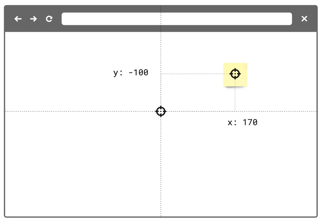 Figure 1. The relativeTo property of the board item—a sticky note in the example image—is set to canvas_center. The same mechanism applies to and works in the same way for all supported board items. |
parent_top_left | The item is positioned on the board, and it is a child of a parent item. For example, a parent frame. The x and y coordinate values of the child item are relative to the top-left corner of the parent item). | 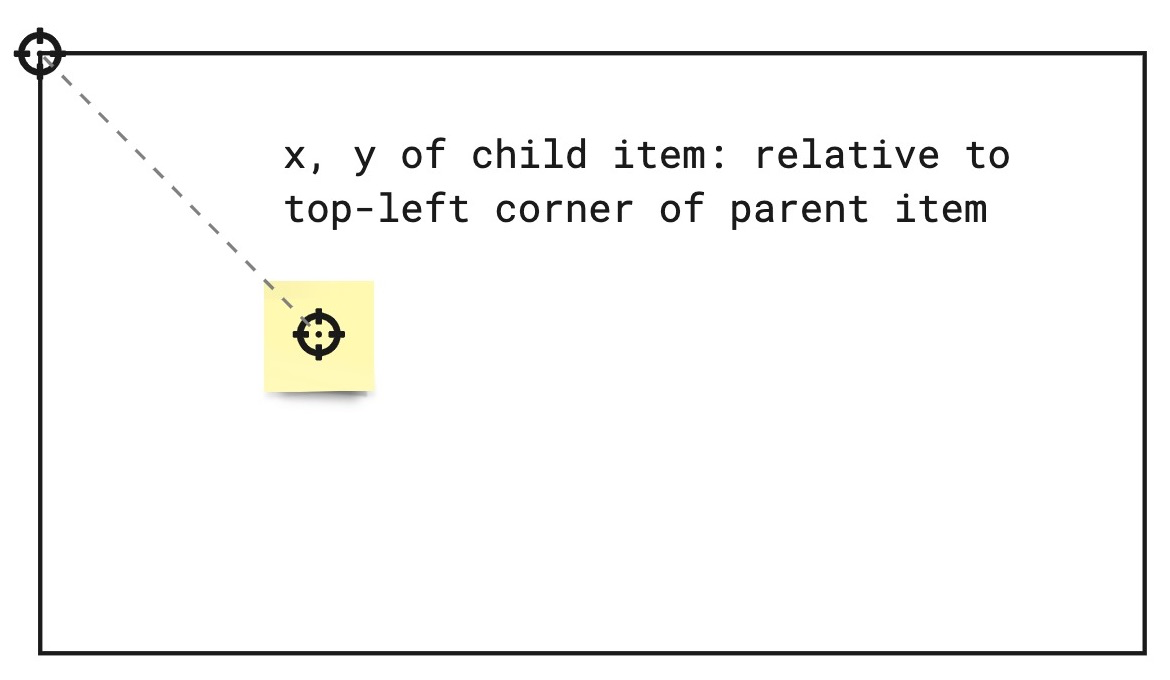 Figure 2. The relativeTo property of the board item—a sticky note in the example image—is set to parent_top_left. The same mechanism applies to and works in the same way for all supported board items. |
parent_center |  Experimental feature Experimental featureThe item is positioned on the board, and it is a child of a parent mind map node. The x and y coordinate values of the item are relative to the center of the parent mind map node item. |  Figure 3. The relativeTo property of the child mind map nodes is set to parent_center. |
See also:
linkedTo?
string
linkedTo is the namespace that enables links to be associated to items on the board.
When this property is utilized, the associated item will display an arrow icon on its top right corner. On click, this icon will navigate to the associated link.
For links that point to another item on the same board, the viewport will automatically move to that item when true is returned.
For links that point to an item on a separate board or an external url, a new tab tab will be opened.
Note: Items of type
tagdo not support thelinkedToproperty.
To link an item to another item on the same board, a valid url with an item id must be specified:
const [geoCard] = await miro.board.get({type: 'card'});

const widgetId = `00000000000000000`;
const boardId = 'xxxxxxxxxxx';

// Generate url based on boardId and widgetId
geoCard.linkedTo = `https://miro.com/app/board/${xxxxxxxxxxx}/?moveToWidget=${widgetId}`;

// OR you can use relative URL
geoCard.linkedTo = `/app/board/${xxxxxxxxxxx}/?moveToWidget=${widgetId}`;

// OR you can generate url based on current URL by simply change of query param
const searchParams = new URLSearchParams(window.location.search);
searchParams.set('moveToWidget', widgetId);
const newRelativePathQuery = `${window.location.pathname}?${searchParams.toString()}`;
geoCard.linkedTo = newRelativePathQuery;
To unlink an item to the provided url, set the property to undefined or pass an empty string "":
const [geoCard] = await miro.board.get({type: 'card'});
// Unlink the widget
geoCard.linkedTo = '';
// or
geoCard.linkedTo = undefined;

await geoCard.sync();

console.log(geoCard.linkedTo); // will return empty string: ''
createdAt
readonly string
Timestamp
Date and time when the item was created.
Format: UTC, ISO 8601.
Includes a trailing Z offset.
Example: 2021-05-18T07:59:01Z
ℹ️ Note:
- Timestamps indicating creation and update times are always in UTC time, regardless of the time offset configured on the machine where the app runs or where the code is executed.
createdBy
readonly string
Miro users are automatically assigned a unique ID.
createdBy contains the ID of the user who created the item.
Example: 3658432978520043388
modifiedAt
readonly string
Timestamp
Date and time when the item was last modified.
Format: UTC, ISO 8601.
Includes a trailing Z offset.
Example: 2021-05-18T07:59:01Z
ℹ️ Note:
- Timestamps indicating creation and update times are always in UTC time, regardless of the time offset configured on the machine where the app runs or where the code is executed.
modifiedBy
readonly string
Miro users are automatically assigned a unique ID.
modifiedBy contains the ID of the user who applied the most recent edit to the item.
Example: 3658432978520043388
connectorIds?
readonly Array<string>
connectorIds is an array that contains the ids of the connectors attached to the current item.
ℹ️ Note: Items of type tag and frame do not support the connectorIds property.
height
number
Height of the item in dp.
See also:
width
number
Width of the item in dp.
See also:
rotation
number
Rotation angle of an item in degrees, relative to the board.
You can rotate items clockwise (right) and counterclockwise (left) by specifying positive and negative values, respectively.
The rotation property doesn't perform a rotation action on an item; it assigns the item a rotation angle.
Invoking the same rotation value multiple times on an item re-applies the same value; it doesn't result in multiple rotations of the item.
Methods
sync
() => Promise<void>
🔒 Requires scope: boards:write
sync propagates to the board any changes to item and tag properties.
After updating the properties of an item or a tag, sync it with the board to:
- Propagate to the board the changes applied to the item or to the tag.
- Make the changes visible on the board.
All board items and tags require sync to make any changes to their properties visible on the board.
For more information and examples, see Update and sync item properties.
Example:
(The code example updates a text item using sync.
The same mechanism applies to and works in the same way for all supported board items.)
// Create an item.
// In this case, a text item.
const text = await miro.board.createText({
  content: '<p>This is a piece of text to remind me that I always finish what I ...</p>',
  style: {
    fillColor: 'transparent',
    textAlign: 'left',
  },
  x: 0,
  y: 0,
  width: 450,
  rotation: 0.0,
});

// Update the board item by modifying the values of its properties.
// In the text item case, the updated properties modify content, background color, and rotation of the item.
text.content = 'A fourteneer is "A line that rumbles on like this for being a bit too long."';
text.style.fillColor = '#a9fe65';
text.rotation = 180.0;

// Call 'sync' to make the changed board item properties visible on the board.
await text.sync();

// Output the updated board item to the developer console.
console.log(text);
Example:
(The code example updates a tag using sync.
The same mechanism applies to and works in the same way for all supported board items.)
// Create a tag.
const todo = await miro.board.createTag({
  title: 'todo',
  color: 'yellow',
});

// Create a sticky note and attach the tag to it.
const stickyNote = await miro.board.createStickyNote({
  content: 'sticky note with tag: "todo"',
  tagIds: [todo.id],
});
console.log(stickyNote.tagIds); // => ['3074457345627244742']

// Update the tag properties: title and color.
todo.title = "won't fix";
todo.color = 'green';

// Call 'sync' to make the changed tag properties visible on the board.
await todo.sync();

// Output the updated tag to the developer console.
console.log(todo);
getMetadata
(key: string) => Promise<T>
🔒 Requires scope: boards:read
🚦 Rate limit: Level 1
Fetches board item metadata, stored per app, for the specified metadata key.
The response contains the metadata value assigned to the requested key.
To fetch all the metadata for a board item, invoke the method without passing any arguments.
The response contains all the metadata associated with the board item as key/value pairs.
An app can access only the metadata that it sets.
It cannot access metadata set by other apps.
getMetadata and setMetadata are available for the following board items:
- Card
- Connector
- Embed
- Image
- Preview
- Shape
- Sticky note
- Text
The methods aren't available for the following board items:
- Frames
- Unsupported board items
- groups
ℹ️ Note:
- To access board item metadata, apps require the
boards:readpermission. - To store board item metadata, apps require the
boards:writepermission. getMetadatareturns a new object, not a reference to the object that was previously set withsetMetadata.- If the specified key isn't found, the method returns
undefined.
⚠️ Warning:
- Total
ItemMetadatastorage limit:6 KBper item.
Example:
// Get the board item you want to retrieve metadata from.
const [geoCard] = await miro.board.get({type: 'card'});

// Set item metadata for an imaginary geocaching game, and store it to the retrieved card item.
await geoCard.setMetadata('leaderboard', ['Ziltoid', 'Howard', 'Paul']);

// Get the specific 'leaderboard' metadata from the card item.
const leaderboard = await geoCard.getMetadata('leaderboard');

// Get all the metadata from the card item by passing no arguments.
await geoCard.getMetadata();
setMetadata
(key: string, value: title="Json">Json) => Promise<T>
🔒 Requires scope: boards:write
Adds board item metadata to make it available on the board that the app runs on.
An app can access only the board item metadata that it sets.
It cannot access metadata set by other apps.
Board item metadata is stored in the item it refers to. Therefore:
- When duplicating an item, the metadata is copied to the new item.
- When deleting an item, the corresponding metadata is removed with the deleted item.
Board item metadata is synced across, and available to, all the users who can:
- Access and view the board that the app is running on, AND
- Run the app on the board.
ItemMetadata is a key/value-pair object. It can contain values with the following data types:
stringnumberbooleanObjectArraynullundefined
getMetadata and setMetadata are available for the following board items:
- Card
- Connector
- Embed
- Image
- Preview
- Shape
- Sticky note
- Text
The methods aren't available for the following board items:
- Frames
- Unsupported board items
- groups
To overwrite an existing key inside ItemMetadata:
- Pass the same key multiple times with different values. Only the last/most recent value is stored with the key.
To remove a key from ItemMetadata:
- Set the value of the existing key to either
null, orundefined.
This clears the key. If you callgetMetadata(key)to retrieve a key that has been set tonullorundefined, the method returnsundefined.
ℹ️ Note:
- To access board item metadata, apps require the
boards:readpermission. - To store board item metadata, apps require the
boards:writepermission. - You can assign an empty array (
[]) to a key. It's returned as an empty array. - You can assign an empty string (
'') to a key. It's returned as an empty string.
⚠️ Warning:
- Total
ItemMetadatastorage limit:6 KBper item.
Example:
// Get the board item you want to set metadata to.
const [geoCard] = await miro.board.get({type: 'card'});

// Set item metadata for an imaginary geocaching game, and store it to the retrieved card item.
await geoCard.setMetadata('geoData', {
  name: 'null',
  coordinates: {
    latitude: '33.950278',
    longitude: '-105.314167',
  },
  lastFound: '1947-07-08',
  content: true,
  difficulty: 5,
  keywords: ['x-files', 'truth-is-out-there', 'area-51', 'roswell', 'aliens'],
  geoCache: [
    {
      name: 'UFO',
      description: 'Severely damaged unidentified flying object. ',
    },
    {
      name: 'Alien',
      description: 'Remains of an alien life form.',
    },
    {
      name: 'Artifacts',
      description: 'Tools, equipment, and other items found at the crash site.',
    },
    {
      name: 'Edibles',
      description: 'The alien was likely as high as a kite when they crashed. Typical.',
    },
  ],
});

// Get the specific 'geoData' metadata from the card item.
// The response contains the metadata value assigned to the key.
const geoCardGeoData = await geoCard.getMetadata('geoData');

// Get all the metadata from the card item.
// The response contains all the metadata assigned to the board item as key/value pairs.
const geoCardAllMetaData = await geoCard.getMetadata();

// Clear the metadata about the imaginary geocaching game in one of the following ways:
// 1. Assign 'geoData' an empty object.
await miro.board.setMetadata('geoData', {});
// 2. Set 'geoData' to 'undefined'.
await miro.board.setMetadata('geoData', undefined);
// 3. Set 'geoData' to 'null'.
await miro.board.setMetadata('geoData', null);
goToLink
() => Promise<boolean>
🔒 Requires scope: boards:read
goToLink navigates to the provided link associated with the item on a board.
For links that point to another item on the same board, the viewport will automatically move to that item when true is returned.
For links that point to an item on a separate board or an external url, a new tab tab will be opened.
Returns:
Promise<boolean>
true: Link is successfully associated with the item, navigation is triggered, and thelinkedToproperty contains a valid value.false: Link is not successfully associated to the item due to an invalid or missinglinkedToproperty, and no navigation is triggered.
Example:
const [geoCard] = await miro.board.get({type: 'card'});

// Link item to some url
geoCard.linkedTo = 'https://google.com';

// Update widget props and apply changes
await geoCard.sync();

// Navigate to https://google.com (value of `linkedTo` property)
await geoCard.goToLink();
bringToFront
() => Promise<void>
🔒 Requires scope: boards:write
🚦 Rate limit: Level 1
In a stack of items, this method brings an item to the front so that it is at the top of the stack.
When the item is at the front, it is fully visible; The item can partially or completely hide underlying items in the same stack.
ℹ️ Note:
- Frame items don't support the
bringToFront()method.
As a frame item acts as a parent that can contain other items, a frame item is always at the back, relative to any other items on the board.
The only object behind a frame is the board itself.
Example:
// Create three sticky notes
const first = await miro.board.createStickyNote({
  content: 'first',
});

const second = await miro.board.createStickyNote({
  content: 'second',
});

const third = await miro.board.createStickyNote({
  content: 'third',
});

// Bring the first sticky note to the front of the board.
await first.bringToFront();
sendToBack
() => Promise<void>
🔒 Requires scope: boards:write
🚦 Rate limit: Level 1
In a stack of items, it sends an item to the back so that it is at the bottom of the stack.
When it is at the back, item is partially or completely hidden by overlying items in the same stack.
ℹ️ Note:
- Frame items don't support the
sendToBack()method.
As a frame item acts as a parent that can contain other items, a frame item is always at the back, relative to any other items on the board.
The only object behind a frame is the board itself.
Example:
// Create three sticky notes
const first = await miro.board.createStickyNote({
  content: 'first',
});

const second = await miro.board.createStickyNote({
  content: 'second',
});

const third = await miro.board.createStickyNote({
  content: 'third',
});

// Send the third sticky note to the back of the board
await third.sendToBack();
bringInFrontOf
(target: BaseItem) => Promise<void>
🔒 Requires scope: boards:write
🚦 Rate limit: Level 1
In a stack of items, this method sends an item in front of another item (target).
When an item is moved to the front, the item can partially or completely hide underlying items in the same stack.
ℹ️ Note:
- As this method implements relative positioning, you can use this method to place items in front or behind other items.
If you want to send an item all the way to the front,
you can use the methodbringToFront(), which places the item at the top of the stack. - Frame items don't support the
bringInFrontOf()method.
As a frame item acts as a parent that can contain other items, a frame item is always at the back, relative to any other items on the board.
The only object behind a frame is the board itself.
Example:
// Create three sticky notes
const first = await miro.board.createStickyNote({
  content: 'first',
});

const second = await miro.board.createStickyNote({
  content: 'second',
});

const third = await miro.board.createStickyNote({
  content: 'third',
});

// Bring the first sticky note in front of second.
await first.bringInFrontOf(second);
sendBehindOf
(target: BaseItem) => Promise<void>
🔒 Requires scope: boards:write
🚦 Rate limit: Level 1
In a stack of items, this method sends an item behind another item (target).
When an item is moved to the back, the item can be partially or completely hidden by the overlying items in the top of the same stack.
ℹ️ Note:
- As this method implements relative positioning, you can use this method to place items in front or behind other items.
If you want to send an item all the way to the back,
you can use the methodsendToBack(), which places the item at the bottom of the stack. - Frame items don't support the
sendBehindOf()method.
As a frame item acts as a parent that can contain other items, a frame item is always at the back, relative to any other items on the board.
The only object behind a frame is the board itself.
Example:
// Create three sticky notes
const first = await miro.board.createStickyNote({
  content: 'first',
});

const second = await miro.board.createStickyNote({
  content: 'second',
});

const third = await miro.board.createStickyNote({
  content: 'third',
});

// Send the third sticky note behind the second one
await third.sendBehindOf(second);
getLayerIndex
() => Promise<number>
🔒 Requires scope: boards:read
The getLayerIndex() method returns the position of an item in the item stack.
Items in a stack are layered on top of each other based on their layer index value. An item with a higher layer index appears above items with lower layer index values.
Each item on the board has a layer index position in the stack. The higher the layer index value, the "closer" to the user the item appears.
For example, with three items on the board - first, second, and third - their initial layer index values might be:
first[0], second[1], third[2].
The item with layerIndex === 2 (third) will be fully visible at the top of the stack. The item with layerIndex === 1 (second) may be partially hidden by the item above it. And the item with layerIndex === 0 (first) may be fully hidden by the items above it.
Returns:
Promise<number>- callinggetLayerIndex()allows you get the position of a specific item in the stack.
ℹ️ Note:
- The item stack is zero indexed.
- Frame items don't support the
getLayerIndex()method.
As a frame item acts as a parent that can contain other items, a frame item is always at the back, relative to any other items on the board.
The only object behind a frame is the board itself.
Example:
// Create three sticky notes.
// Sticky notes are created on top of each other in the creation order, with the layer index equal to the creation index.
const first = await miro.board.createStickyNote({
  content: 'first',
});

const second = await miro.board.createStickyNote({
  content: 'second',
});

const third = await miro.board.createStickyNote({
  content: 'third',
});

await third.getLayerIndex(); // returns 2
getConnectors
() => Promise<Array<Connector>>
🔒 Requires scope: boards:read
🚦 Rate limit: Level 3
The getConnectors() method returns an array of connector items attached to the current item. The connectors returned correspond to the ids in the connectorIds property of the item.
Example:
// Create two sticky notes linked by a connector.
const startItem = await miro.board.createStickyNote({
  content: 'start',
});

const endItem = await miro.board.createStickyNote({
  content: 'end',
  x: 500,
});

const connector = await miro.board.createConnector({
  start: {
    item: startItem.id,
  },
  end: {
    item: endItem.id,
  },
});

// sync() updates the connectorIds property in startItem
await startItem.sync();

const connectors = await startItem.getConnectors(); // returns [connector]
All properties
| Property | Type |
|---|---|
connectorIds? |
readonly Array<string> |
createdAt |
readonly string |
createdBy |
readonly string |
description |
string |
fields? |
Array<{
  fillColor?: string
  iconShape?: 'round' | 'square'
  iconUrl?: string
  textColor?: string
  tooltip?: string
  value?: string
}>
|
groupId? |
readonly string |
height |
readonly number |
id |
readonly string |
linkedTo? |
string |
modifiedAt |
readonly string |
modifiedBy |
readonly string |
origin |
'center' |
owned |
readonly boolean |
parentId |
readonly 'null' | string |
relativeTo |
'canvas_center' | 'parent_top_left' | 'parent_center' |
rotation |
number |
status |
'disabled' | 'disconnected' | 'connected' |
style |
{ cardTheme?: string; fillBackground?: boolean }
|
tagIds |
Array<string> |
title |
string |
type |
readonly 'app_card' |
width |
number |
x |
number |
y |
number |
bringInFrontOf(...) |
(target: BaseItem) => Promise<void> |
bringToFront(...) |
() => Promise<void> |
getConnectors(...) |
() => Promise<Array<Connector>> |
getLayerIndex(...) |
() => Promise<number> |
getMetadata(...) |
(key: string) => Promise<T> |
goToLink(...) |
() => Promise<boolean> |
sendBehindOf(...) |
(target: BaseItem) => Promise<void> |
sendToBack(...) |
() => Promise<void> |
setMetadata(...) |
(key: string, value: title="Json">Json) => Promise<T> |
sync(...) |
() => Promise<void> |
Updated 7 months ago